What Color Makes a House Look Expensive?
It is almost never a bold color. The homes that read high-end lean on warm, muted neutrals and one continuous, warm-toned floor. Here is the palette that looks expensive, and where the biggest surface in the room fits.
What Color Makes a House Look Expensive?
Warm, muted neutrals make a house look expensive — soft whites, greige, taupe, and warm mid-tone woods used tonally across a space. A home reads high-end when its colors stay in a restrained, cohesive palette with one deep anchor and quiet contrast, rather than bright or clashing colors competing for attention.
“Expensive” rarely comes from a striking color. It comes from restraint and cohesion. The rooms that photograph like a design magazine tend to live in a narrow band of warm neutrals — a soft white on the walls, a greige or taupe supporting it, warm wood underfoot, and a single deep tone doing the accent work. Nothing shouts. Everything agrees.
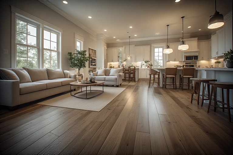
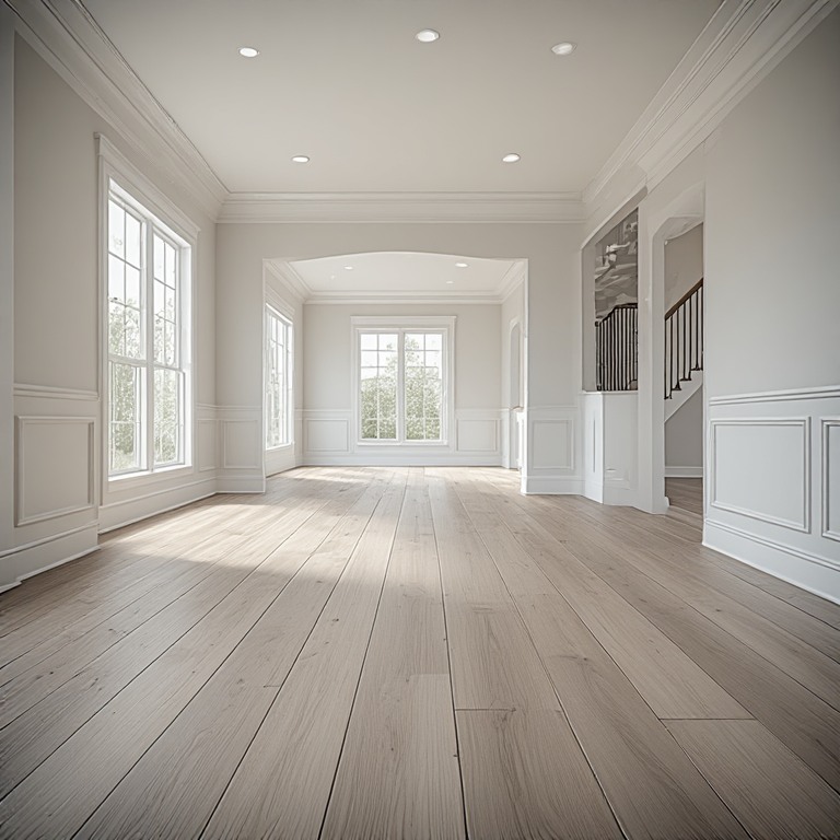
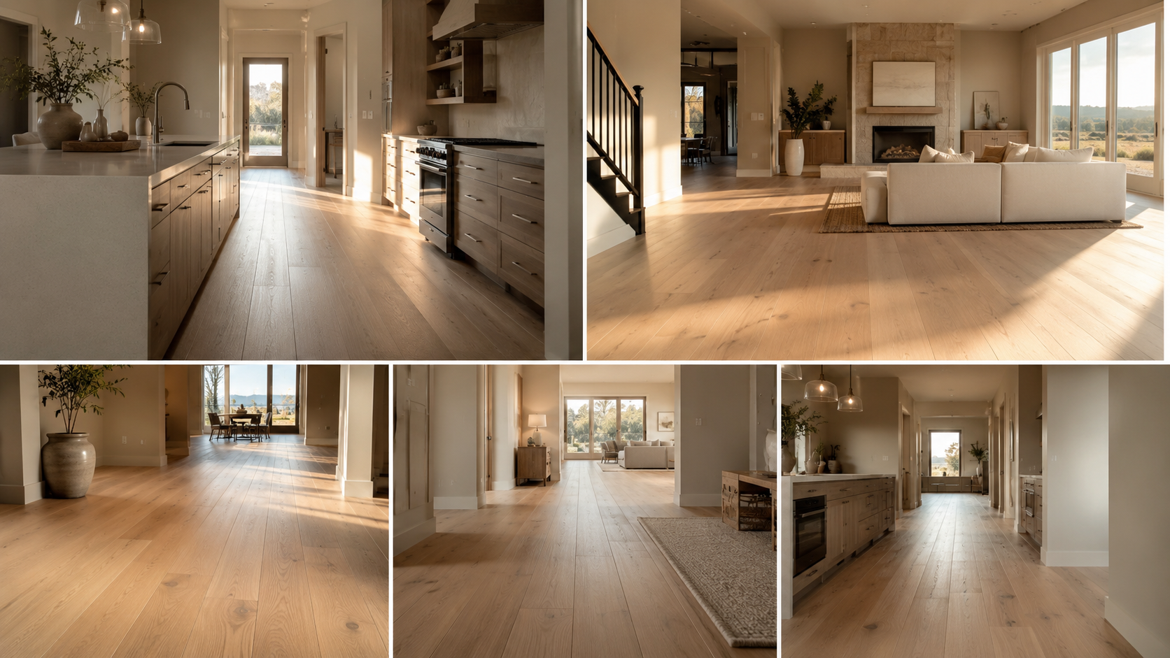
And the floor does more of that work than any paint color. It is the largest continuous surface in the room, so its tone quietly sets the temperature of the entire palette. A warm, mid-tone floor running uninterrupted through a space reads instantly more expensive than the same square footage chopped up by transitions and mismatched tones. That is where Floors and Beyond VA starts every color conversation — with the surface that anchors the rest.
In Northern Virginia’s higher-end renovations — McLean, Great Falls, Vienna, Old Town Alexandria — the “expensive” look is remarkably consistent: warm wide-plank white oak, a matte finish, carried across the whole main level.
Which colors actually read expensive?
Warm whites & creams
On walls and trim, a warm white feels calm and custom. Skip the stark, cool, blue-based whites — they read cold and builder-grade under Northern Virginia’s changing daylight.
Greige & warm taupe
The flexible mid-neutral that bridges wall and floor. Warm greige has quietly replaced the cool greys that dated so fast, and it flatters warm-toned wood beautifully.
Warm mid-tone wood
The floor is the palette’s foundation. Warm white oak in a matte or wire-brushed finish sets the temperature for everything above it — and it is the single most convincing expensive-look move.
One deep tone
A single espresso, charcoal, or deep-green moment — a door, a cabinet, a fixture — adds richness. Used sparingly it reads intentional; scattered everywhere it reads busy.
Expensive vs. cheap: the same room, different choices
| Element | Reads expensive | Reads dated / cheap | Northern Virginia note |
|---|---|---|---|
| Floor tone | Warm mid-tone white oak | Orange-toned oak; flat cool grey | Warm oak is the clear current direction in local renovations |
| Floor layout | One continuous floor, wide plank | Changes at every doorway; narrow strips | Open-concept slab homes in Ashburn and Sterling gain the most |
| Finish | Matte or wire-brushed | High-gloss | Low sheen hides scuffs and pollen dust and reads custom |
| Walls | Warm white or greige | Bright or cool blue-white | Warm tones flatter refinished oak in pre-war homes |
| Accent | One restrained deep tone | Several competing bright colors | Let brass or bronze hardware carry the shine, not the floor |
“Nothing makes a home look more expensive than one warm floor running through the whole level. It is not the price of the material — it is the continuity. Break it up with transitions and even a costly floor looks builder-grade.”
After nearly 40 years walking floors across the region, that is the pattern owner Floors and Beyond comes back to: the expensive look is warmth carried without interruption. It is why Floors and Beyond VA assesses the whole main level as one surface before recommending a single plank — and why, in pre-war homes with original hardwood, the first question is always whether that floor can be refinished into the warm tone the room wants rather than replaced.
Want the high-end look, decided from the floor up?
Floors and Beyond VA will walk your rooms and set the anchor tone before you spend a dollar on paint.
Frequently asked questions
What color floor makes a house look expensive?
A warm, mid-tone white oak with a matte or wire-brushed finish, laid in wide planks, reads the most expensive. Warmth and a low-sheen finish signal custom work — and running that floor continuously across the space does more for the high-end look than the material’s price tag.
Does grey flooring look cheap now?
Cool, flat grey flooring has dated quickly and can read builder-grade in 2026. Warm greige and warm oak tones are the current direction. Grey itself is not the problem — the cool, lifeless undertone is, and a warmer neutral fixes it.
Do dark or light floors look more expensive?
Both can. It is not about light versus dark — it is about warmth, a matte finish, wide planks, and running one floor continuously through the space. A warm light oak and a warm espresso can each read high-end when the rest of the palette stays restrained.
What is the biggest mistake that makes a home look cheap?
Too many colors and a broken-up floor. Changing flooring at every doorway and mixing several bright wall colors chops a home into pieces. One warm, continuous floor and a narrow palette instantly reads more expensive — which is the first thing Floors and Beyond VA looks to fix.
Start with the floor. The rest follows.
The expensive look is warmth, restraint, and continuity — and it begins with the largest surface in the room. Let’s get your anchor tone right.
Book Your Consultation